Mayumiotero – Retro Web Design is finding a fresh place in today’s digital world. Designers are bringing back pixel graphics, bold colors, playful typography, and nostalgic computer elements. However, this revival is not simply about copying old websites. Modern creators combine vintage visual ideas with cleaner layouts and better usability. As a result, websites can feel nostalgic without becoming difficult to navigate. The trend also offers an alternative to highly polished designs that often look similar. For creative brands, that difference can be valuable. A retro-inspired page can create personality from the first screen. Meanwhile, modern technology keeps the experience responsive and practical. This balance between memory and function explains much of the style’s appeal. The internet keeps moving forward, yet designers are discovering that its visual past still offers plenty of inspiration.
Read Also: Intel CPU Prices Could Rise 10% as the Chipmaker Prepares for Its Next Big Launch
The Digital Past Becomes a New Source of Inspiration
Early websites had technical limits that strongly shaped their appearance. Screens offered lower resolutions, connections were slower, and design tools were less advanced. Therefore, creators often worked with simple graphics, basic layouts, and limited visual effects. Those limitations eventually produced a recognizable digital language. Today, designers can recreate that character intentionally. Pixel icons, visible borders, chunky buttons, and simple illustrations can all reference earlier internet eras. However, modern designers have much more control over the final result. They can use responsive grids, scalable graphics, and efficient code behind the nostalgic surface. Consequently, the style becomes an interpretation rather than a historical copy. This distinction matters because successful retro design should still serve modern users. In my view, the strongest projects borrow the personality of old websites while leaving their technical frustrations behind.
Why Retro Web Design Feels Fresh Again
Digital design has become increasingly polished over the years. Clean grids, neutral colors, large photographs, and simple navigation now appear across many websites. These choices often improve usability. However, they can also make unrelated brands feel surprisingly similar. Retro Web Design offers a different visual direction. It embraces character, imperfection, and unexpected details. A pixelated icon or unusual typeface can instantly change the mood of a page. Moreover, nostalgia can create an emotional connection before visitors read much content. People who remember older computers may recognize familiar visual cues. Younger audiences can also enjoy the aesthetic without having experienced that era directly. Therefore, retro design works on more than one level. It can feel familiar, playful, and unconventional at the same time. That combination helps explain why designers continue exploring older digital styles.
Pixel Graphics Bring Personality Back to the Screen
Pixel graphics remain one of the clearest symbols of early digital culture. In the past, pixels were often visible because screens and graphics had limited resolution. Today, designers can hide individual pixels easily. Yet, some deliberately make them visible again. Pixel icons, illustrations, cursors, and decorative objects can give a website an immediate retro identity. Furthermore, these elements work particularly well for gaming, music, fashion, and creative portfolios. The key is moderation. Covering every part of a website with pixel art can create visual noise. Instead, designers can use it to guide attention toward important areas. A pixel icon beside a navigation label may be enough. Likewise, one large pixel illustration can become a memorable hero image. Modern interfaces benefit when decorative choices have a clear purpose. Therefore, pixel graphics work best as part of a structured visual system rather than random decoration.
Bold Typography Creates a Strong Visual Voice
Typography can define the personality of a website before visitors notice anything else. Retro-inspired projects often use chunky display fonts, pixel lettering, condensed type, or exaggerated geometric shapes. These choices can create a powerful visual identity. However, readability must remain a priority. A decorative font may look impressive in a headline but become tiring in a long paragraph. For that reason, designers often pair expressive headings with simpler body text. This combination provides contrast while keeping articles and product descriptions easy to read. Size also matters. Large headlines can create a poster-like feeling that suits retro aesthetics. Meanwhile, generous spacing prevents the composition from feeling crowded. Good typography is not simply decoration. It creates hierarchy and guides the reader through information. Therefore, a retro typeface should support the page rather than compete with its content.
Retro Color Palettes Can Change the Entire Mood
Color gives Retro Web Design much of its emotional power. Different periods can inspire very different palettes. A 1970s influence may include orange, brown, mustard, and cream. In contrast, an arcade-inspired design might feature bright neon shades against dark backgrounds. Y2K-inspired pages can introduce silver, blue, pink, or glossy gradients. However, successful color choices require more than nostalgia. Designers also need enough contrast between text and background. Otherwise, an attractive palette may reduce readability. One practical approach is to choose a small group of dominant colors. Then, brighter shades can highlight buttons, links, or important messages. This creates visual consistency while preserving the playful spirit of the style. Color should also support the brand’s personality. Therefore, designers should not choose a retro palette simply because it looks fashionable. The colors need to strengthen the overall message.
Old Computer Interfaces Inspire Modern Layouts
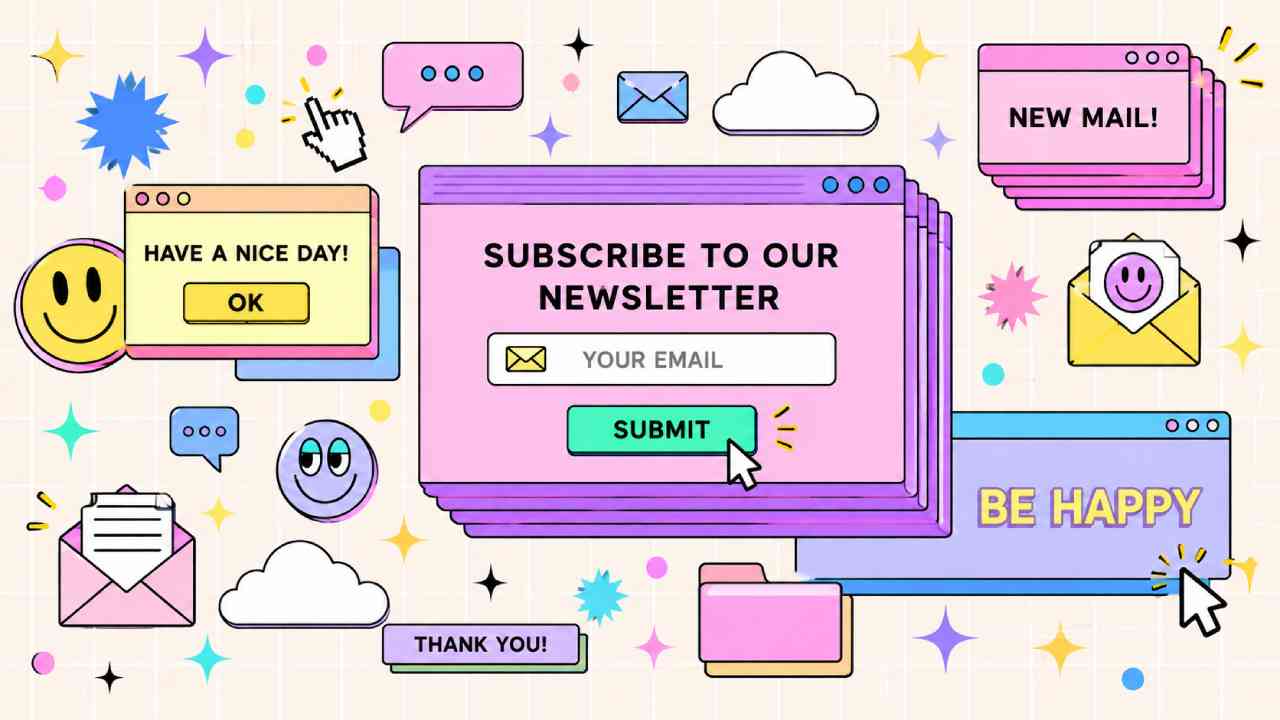
Classic computer interfaces provide another rich source of inspiration. Designers can recreate window frames, dialog boxes, desktop icons, progress bars, and menu panels. These familiar shapes can turn a standard website into an interactive digital environment. For example, a portfolio may present projects inside movable-looking windows. A music website could organize albums like files on an old desktop. However, visual imitation should never confuse navigation. Visitors still need to understand where to click and how to return to important sections. Therefore, familiar modern patterns should remain beneath the retro styling. Buttons need clear states, menus need logical labels, and mobile layouts need careful adaptation. When these details work together, an old computer interface can feel playful rather than frustrating. The visual language comes from the past, but the interaction should meet current expectations.
Modern UX Keeps Nostalgia Easy to Use
A successful retro website should look nostalgic without behaving like an outdated website. This is where modern user experience becomes essential. Visitors now expect fast loading, mobile compatibility, clear navigation, and readable content. Therefore, visual experimentation should not interfere with basic tasks. Animated cursors, decorative GIF-like elements, and unusual transitions can create atmosphere. However, too many moving elements may distract users. The same principle applies to navigation. A creative menu can still use clear labels and predictable behavior. Accessibility also deserves attention. Strong contrast, keyboard-friendly controls, descriptive text, and logical page structure help more people use a website comfortably. In other words, nostalgia should sit on top of a reliable foundation. This approach gives designers freedom without sacrificing usability. Ultimately, the best retro experiences feel unusual visually but familiar when users interact with them.
Retro Design Can Give Brands a Distinct Identity
Standing out online has become difficult because many websites follow similar visual patterns. For some brands, retro styling provides an opportunity to build a stronger identity. Music labels, fashion projects, game studios, creative agencies, and entertainment brands can benefit from its expressive nature. Nevertheless, the style should match the audience and message. A nostalgic arcade interface might work beautifully for a game studio. The same concept may feel inappropriate for a service that requires a highly formal tone. Context matters. Designers should first understand the brand’s personality and users. After that, they can select retro elements that support those qualities. This approach prevents nostalgia from becoming a superficial theme. Instead, the design becomes part of the brand story. When every visual choice has a reason, visitors are more likely to remember the experience.
Read Also: Coffee Corner at Home Turns Small Spaces Into Cozy Cafés
Y2K Aesthetics Add Another Layer of Nostalgia
Retro digital design does not only refer to the earliest days of the internet. The late 1990s and early 2000s now provide another major source of visual inspiration. Y2K aesthetics often feature metallic surfaces, glossy buttons, futuristic shapes, bright gradients, and playful typography. At the time, these elements represented an optimistic vision of technology. Today, they carry a nostalgic quality. Designers can reinterpret them with modern tools and cleaner layouts. For instance, a metallic headline can become the central visual feature while the rest of the page stays minimal. Likewise, glossy icons can add personality without overwhelming the interface. This selective approach often feels more sophisticated than recreating every detail from the period. Moreover, it allows designers to blend several generations of digital culture. The result can feel nostalgic, futuristic, and contemporary at once.
Performance Still Matters Behind the Visual Style
Creative design should never become an excuse for a slow website. Large animations, custom fonts, background videos, and oversized images can increase loading time. Therefore, designers need to consider performance while developing retro visuals. Images should be compressed carefully, and unnecessary scripts should be removed. Likewise, fonts should be selected with both appearance and loading efficiency in mind. Responsive design is equally important because users visit websites from many screen sizes. A desktop-inspired layout may look impressive on a large monitor. However, it needs a thoughtful mobile version as well. Performance also supports search visibility and user satisfaction. Visitors are more likely to explore a site when pages respond quickly. Consequently, technical quality should remain part of the creative process. The visual surface may celebrate older technology, but the website underneath should take advantage of modern development practices.
The Future of Retro Web Design Looks Surprisingly Modern
The renewed interest in Retro Web Design shows how creative trends often move in cycles. Designers regularly return to older ideas and reinterpret them for new audiences. Yet, this trend is especially interesting because the internet now has enough history to reference itself. Pixel graphics, old browser windows, early computer icons, and Y2K interfaces have become recognizable design languages. Still, their future depends on thoughtful execution. Simply copying an old website may create novelty, but novelty can disappear quickly. A stronger approach combines nostalgic details with modern typography, responsive layouts, accessibility, and fast performance. That balance gives the style more lasting value. Ultimately, retro design works because it offers something many polished websites lack: visible personality. It reminds visitors that digital spaces can be playful and expressive. The technology has changed dramatically, but the creative spirit of the early web can still inspire what comes next.