Mayumiotero – Neo-Memphis Design brings bold geometry, playful patterns, and expressive colors into today’s creative landscape. At first glance, the style can feel spontaneous. Circles float beside zigzag lines, curved forms interrupt rigid grids, and contrasting shapes compete for attention. However, successful compositions are rarely random. Instead, designers carefully balance energy with visual order. This approach has become useful in a digital world filled with clean layouts and predictable templates. While minimalism still has an important place, audiences often respond to visuals that show more personality. Neo-Memphis offers exactly that opportunity. It can feel youthful without becoming childish and expressive without losing clarity. Moreover, the style adapts easily to branding, websites, packaging, editorial graphics, and social content. In my view, its strongest quality is flexibility. Designers can borrow only a few Memphis-inspired elements or build an entire visual identity around them.
Read Also: Google Launches Gemini 3.7 Flash Just Three Weeks Later With Much Lower Pricing
The Creative Roots Go Back to 1980s Milan
To understand the modern movement, it helps to look at its origins. The original Memphis Group emerged in Milan in the early 1980s under the leadership of Italian architect and designer Ettore Sottsass. Its designers challenged the restrained ideas that had dominated much of modern design. Rather than hiding decoration, they celebrated it. Furniture featured unusual shapes, unexpected patterns, bright colors, and unconventional material combinations. As a result, Memphis became instantly recognizable. Yet it was also controversial. Some observers considered the work exciting, while others found it deliberately excessive. That tension became part of its identity. Today, Neo-Memphis does not simply copy those original objects. Instead, contemporary designers reinterpret their rebellious attitude. They often reduce visual clutter, introduce digital techniques, and use more controlled color palettes. Therefore, the connection is philosophical as much as visual: both approaches encourage designers to question whether everything needs to look serious.
Bold Geometry Creates Its Distinctive Visual Language
Geometry forms the backbone of Neo-Memphis Design. Circles, triangles, arches, rectangles, dots, waves, and irregular lines often appear within the same composition. However, the most effective designs avoid adding shapes without purpose. Each element should support hierarchy, movement, or balance. For example, a large circle behind a product can establish a focal point. Meanwhile, smaller dots can fill negative space without stealing attention. A diagonal line may guide the viewer toward an important message. Consequently, simple shapes can perform several visual tasks at once. Modern designers also experiment with depth. Flat geometric forms may sit beside soft shadows, translucent surfaces, or three-dimensional objects. This mixture gives Neo-Memphis a contemporary character. More importantly, it allows designers to control how energetic the composition feels. A few carefully positioned forms can create a sophisticated result, whereas dozens of overlapping shapes can produce a louder and more experimental identity.
Color Turns Simple Shapes Into Strong Statements
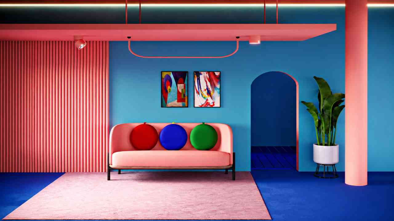
Color is another major reason this style attracts attention. Traditional Memphis imagery is often associated with bright pink, yellow, blue, red, green, and black. Contemporary interpretations, however, have much greater freedom. Designers may choose soft pastels, earthy combinations, muted neutrals, or highly saturated digital colors. Therefore, Neo-Memphis does not depend on one fixed palette. The relationship between colors matters more than the individual shades. For a lifestyle brand, warm peach and soft blue can create an approachable mood. In contrast, electric green against deep purple can produce a stronger digital identity. Neutral backgrounds can also help colorful geometric elements stand out. Still, accessibility should remain part of the decision. Strong contrast is especially important when text appears over decorative backgrounds. In practice, a limited palette often produces better results than using every available color. The design stays expressive, while the viewer can still understand its hierarchy quickly.
Modern Technology Has Given the Style New Dimensions
Digital tools have expanded what designers can achieve with Neo-Memphis Design. Earlier Memphis works relied heavily on physical materials, furniture construction, print, and surface patterns. Today, designers can create similar visual ideas with vectors, 3D rendering, motion graphics, and interactive elements. Consequently, the style is no longer limited to static compositions. A circle can slowly rotate on a website. Geometric objects can respond to cursor movement. Meanwhile, 3D shapes can use glass, chrome, clay, or translucent materials. These techniques add depth without abandoning the original playful spirit. Nevertheless, technology should support the concept rather than become the concept itself. Adding complex effects to every element can quickly make a composition exhausting. I find that the strongest contemporary examples usually combine simple geometry with one distinctive digital technique. This creates enough visual surprise while keeping the overall experience clear, functional, and memorable.
Brands Can Use Neo-Memphis Without Looking Childish
One common misconception is that Neo-Memphis only suits children’s products or playful entertainment brands. In reality, the style can become surprisingly sophisticated when designers control its intensity. A premium brand, for instance, could use a neutral background with only two geometric accents. Matte textures and subtle shadows can replace highly saturated patterns. Likewise, elegant typography can provide contrast against unconventional shapes. As a result, the visual identity retains personality without losing credibility. This balance matters because branding must do more than attract attention. It also needs to remain recognizable across websites, packaging, advertising, and social platforms. Therefore, brands should establish clear rules for shape, color, spacing, and typography before expanding the system. Consistency turns playful elements into recognizable assets. Without those rules, the same design language can quickly feel random. Used carefully, Neo-Memphis can communicate confidence, creativity, openness, and a willingness to challenge predictable visual conventions.
Digital Content Gives Neo-Memphis Room to Experiment
Social media and digital publishing provide an ideal environment for Neo-Memphis Design. Users often scroll through large amounts of content in seconds. Consequently, a distinctive composition has only a brief opportunity to capture attention. Bold geometric elements can create that initial visual interruption. However, grabbing attention is only the first step. The design must still communicate its subject clearly. For article imagery, one effective approach is to keep the main photograph realistic while adding Memphis-inspired forms around it. This creates a bridge between photography and graphic illustration. Similarly, social posts can use repeating geometric elements to establish visual consistency across a campaign. Motion can add another layer. Small animated shapes or transitions can make short-form content feel more dynamic. Still, restraint remains important. Decorative elements should frame the story rather than compete with it. When the subject remains dominant, the style feels intentional instead of merely fashionable.
Read Also: Creative Gift Ideas That Feel Thoughtful and Truly Personal
The Best Compositions Balance Playfulness With Negative Space
Perhaps the biggest challenge in Neo-Memphis is knowing when to stop. Because the visual language encourages experimentation, designers can easily add too many patterns, shapes, colors, and effects. Yet empty space is often what makes those expressive elements successful. Negative space gives the eye somewhere to rest. Moreover, it strengthens contrast between the background and important objects. Consider a composition with one large arch, three smaller circles, a product photograph, and a short headline. If each element has enough breathing room, the overall design can feel bold and premium. Add another twenty shapes, however, and the hierarchy may disappear. For this reason, modern Neo-Memphis often feels more controlled than its historical inspiration. Designers preserve the playful vocabulary while introducing stronger grids and spacing systems. This combination is especially effective for contemporary digital work, where clarity remains essential across different screen sizes.
Typography Can Strengthen or Calm the Composition
Typography deserves special attention because it can completely change the personality of Neo-Memphis Design. Bold geometric sans-serif fonts naturally complement circles, rectangles, and other graphic forms. However, they are not the only option. A restrained typeface can create useful tension against an energetic background. For example, clean typography paired with irregular geometry can make an editorial layout feel sophisticated rather than chaotic. Designers should also avoid using too many font styles. Usually, one expressive display face and one highly readable supporting typeface are enough. Furthermore, spacing can be just as important as font selection. Generous margins and clear line spacing help written information remain readable when decorative elements surround it. This is especially important for mobile interfaces. Ultimately, typography should establish hierarchy first and personality second. When those priorities are reversed, even an attractive Neo-Memphis composition may become difficult to navigate.
Neo-Memphis Works Best When Creativity Has a Purpose
The lasting appeal of Neo-Memphis comes from more than nostalgia. It represents a broader desire to make digital design feel less predictable. After years of highly standardized interfaces and minimalist visual systems, playful geometry offers designers another way to communicate emotion and individuality. Nevertheless, simply adding colorful shapes does not automatically create strong design. Every choice should relate to the audience, message, and platform. A food campaign may benefit from cheerful organic forms, while a technology brand might prefer sharper geometry and dimensional materials. Meanwhile, an editorial illustration can embrace greater experimentation because it does not need to function like an interface. This adaptability gives Neo-Memphis Design considerable creative value. Its strongest modern form combines the freedom of its 1980s roots with contemporary principles of hierarchy, accessibility, and usability. When those elements work together, playful design becomes more than decoration. It becomes a memorable visual language.