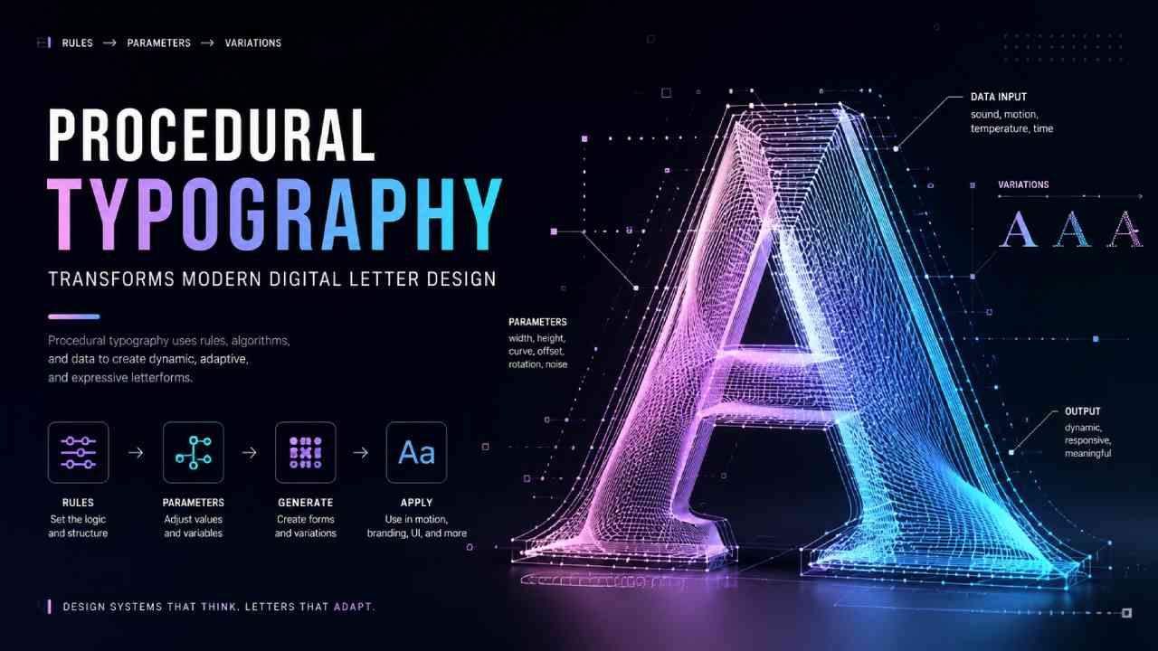
Mayumiotero – Procedural Typography is changing how designers approach letters in modern digital environments. Instead of shaping every character by hand, designers can build rules that control form, spacing, movement, distortion, and other visual properties. As a result, typography can become dynamic rather than remain fixed. A single system may generate many variations while keeping a recognizable visual identity. Moreover, these methods connect traditional typography with computational design, creative coding, motion graphics, and interactive media. The technology may sound complex, yet the basic idea is straightforward. Designers create a visual framework and decide which properties can change. Software then executes those instructions. However, good results still depend on human judgment. Designers must balance experimentation with readability and purpose. Therefore, Procedural Typography is best understood not as an automated replacement for typography, but as a flexible method for expanding what letterforms can do.
Read Also: Google’s New AI Study Tools Turn Gemini Into an Exam Prep Partner
Procedural Typography Turns Letterforms Into Visual Systems
Traditional typography often begins with an existing typeface. Designers select a font, adjust its size, choose a weight, and refine spacing. Procedural Typography approaches the process from another direction. Instead of treating every letter as a completely fixed object, it treats letterforms as structures that can respond to predefined rules. For example, a designer might create a letter from geometric lines. A parameter could then control the length, thickness, angle, or number of those lines. Changing one value may produce a noticeably different version of the same character. However, the underlying system remains consistent. This approach can create families of related forms without manually drawing every variation. In my view, that is one of its strongest qualities. The designer moves beyond creating a single composition and begins designing the logic behind an entire visual language.
Rules and Parameters Shape Every Visual Variation
Rules are at the heart of procedural design. A designer first decides which characteristics should remain stable and which ones may change. Width, height, stroke thickness, curvature, rotation, spacing, and distortion can all become adjustable parameters. However, those variables should not change without purpose. Effective systems establish boundaries that preserve the identity of each letter. For instance, increasing stroke thickness may also require adjustments to internal spaces. Otherwise, characters can quickly become difficult to recognize. Designers can also connect several parameters. When a letter grows taller, its width may automatically become narrower. As a result, one change produces a coordinated transformation. This relationship between variables is what makes procedural approaches powerful. Instead of manually correcting each version, the system handles repeated decisions. Nevertheless, designers still determine the rules, test the outcomes, and decide which variations deserve to be used.
Creative Coding Expands the Possibilities of Typography
Creative coding gives designers another way to explore Procedural Typography. Rather than using software only through traditional visual interfaces, designers can write instructions that generate shapes and behaviors. A program might divide a letter into hundreds of points and move those points according to mathematical rules. Alternatively, characters can react to time, movement, sound, or user input. This process allows typography to behave more like a living visual system. However, coding skill alone does not guarantee strong design. Composition, hierarchy, rhythm, and readability remain essential. Therefore, successful projects combine computational thinking with established design principles. The code becomes a tool for executing an idea rather than the idea itself. This distinction is important because visually complex results can easily become meaningless experiments. When creative coding supports a clear concept, procedural letterforms can communicate in ways that static typography cannot easily achieve.
Data Can Become Part of the Letterform
One fascinating possibility is connecting typography with data. Instead of displaying information only through charts or numbers, designers can allow data to influence the appearance of letters. Imagine a weather display where characters become wider as temperatures rise. Meanwhile, increased rainfall could change their vertical proportions. A music visualization might alter stroke thickness according to sound intensity. Likewise, an exhibition installation could transform text based on visitor numbers. These examples turn typography into both language and visualization. Nevertheless, the relationship between information and visual change must remain understandable. If too many variables control the design, viewers may struggle to recognize what the transformation means. Therefore, designers need a clear hierarchy. One or two meaningful relationships can often communicate more effectively than dozens of complicated effects. Used carefully, data-driven letterforms can make abstract information feel immediate and visually engaging.
Interactive Typography Responds to the Audience
Digital environments allow typography to react directly to people. A letter can change when someone moves a cursor, touches a screen, speaks into a microphone, or approaches an installation. Consequently, the audience becomes part of the visual experience. Consider a digital poster where letters stretch toward the pointer. Another project might allow words to scatter when a viewer moves closer to a screen. Once the interaction stops, the typography could gradually return to its original form. These behaviors create a relationship between communication and participation. However, interaction should support the message rather than become a distraction. A dramatic animation may look impressive for several seconds, yet it can reduce usability if important information becomes unreadable. Therefore, interactive typography requires careful testing. Designers need to consider both visual impact and the practical experience of reading.
Procedural Typography Does Not Need a Futuristic Style
Procedural methods are often associated with futuristic graphics, glowing interfaces, and experimental digital posters. However, the technique itself does not require any particular aesthetic. A procedural system can generate elegant serif letters, organic forms, geometric characters, or shapes inspired by handwriting. It can even reproduce visual qualities associated with historical printing. The important distinction lies in the process rather than the appearance. A designer creates rules that determine how the typography behaves. Consequently, two procedural projects can look completely different while sharing similar technical principles. This flexibility makes the approach useful across many creative disciplines. A luxury brand might use subtle variations in letter width. Meanwhile, an experimental music festival could use extreme distortion and animation. Technology provides the mechanism, but art direction determines the personality. Therefore, procedural design should not be mistaken for a visual style by itself.
Generative and Procedural Typography Are Closely Connected
The terms procedural and generative typography often appear together. Although they overlap, their emphasis can differ. Procedural methods focus strongly on the rules and processes used to construct or transform letterforms. Generative typography often emphasizes systems capable of producing many outcomes. Those outcomes may involve randomness, algorithms, datasets, or other inputs. In practice, a project can easily belong to both categories. For example, a designer could define procedural rules for constructing letters. Then, a generative system could randomly adjust selected parameters within controlled limits. Each output would look different, yet all versions would share the same underlying structure. Therefore, strict boundaries between these terms are not always useful. Understanding the design logic matters more. Both approaches encourage designers to think beyond a single finished image and consider systems capable of producing families of related visual results.
Dynamic Brand Identities Gain New Creative Possibilities
Brand identity is an especially interesting application for Procedural Typography. Traditional branding often depends on a fixed logo and carefully controlled type system. Digital platforms, however, have created more opportunities for identities that can change while remaining recognizable. A procedural wordmark could adjust its proportions according to screen size. Another identity might respond to location, time, sound, or content. As a result, the brand remains consistent at the system level without repeating exactly the same graphic everywhere. This approach can be particularly effective for cultural institutions, technology companies, festivals, and media platforms. Still, flexibility requires strong boundaries. If every variation looks unrelated, recognition can disappear. Therefore, designers must identify which characteristics remain constant. A distinctive structure, motion behavior, or typographic proportion can provide continuity even when other elements change.
Motion Design Gives Letters a Sense of Behavior
Motion adds another dimension to procedural letterforms. Instead of simply moving a finished word across the screen, designers can animate the internal structure of each character. Strokes may expand, collapse, rotate, or reorganize according to specific rules. Consequently, letters appear to have behavior rather than simple movement. This approach works well in title sequences, digital campaigns, event graphics, and interactive displays. Timing becomes especially important. A transformation that happens too quickly may be difficult to understand. Conversely, an animation that moves too slowly can lose energy. Designers must also decide when the letter should remain readable. Sometimes, temporary abstraction can support an expressive concept. However, essential information should eventually return to a recognizable state. In this way, motion becomes part of the typographic hierarchy rather than a decorative effect added afterward.
Read Also: Pressed Flower Art, Turning Beautiful Blooms Into Lasting Memories
Readability Remains One of the Biggest Design Challenges
Experimentation creates opportunities, but it also introduces risks. A procedural system can easily produce beautiful letterforms that are difficult to read. Extreme distortion may close counters, merge strokes, or make similar characters indistinguishable. Therefore, readability should be considered while the system is being designed, not after it is finished. The required level of clarity depends on context. A large exhibition title can tolerate more experimentation than navigation text on a website. Likewise, an artistic poster may intentionally challenge the viewer. Functional interface labels usually cannot. Designers should test outputs at different sizes and on different screens. They should also examine unexpected combinations produced by the system. In my view, the strongest procedural typography does not simply demonstrate technical complexity. Instead, it knows when to experiment and when to preserve clarity.
Human Decisions Still Define the Quality of the Design
Automation can generate hundreds or thousands of visual variations. Yet quantity does not automatically produce quality. Designers still need to decide what the system should communicate, how it should behave, and where its boundaries should exist. They also need to review results and identify failures. In fact, procedural workflows can make art direction even more important. A poorly designed rule can generate the same problem across every output. Conversely, a thoughtful system can create enormous variety without losing coherence. This means designers are not simply handing creative control to software. Their role shifts toward building frameworks, defining relationships, and curating results. Moreover, cultural context and audience expectations cannot be reduced to technical parameters alone. Human judgment remains necessary for interpreting those factors. Therefore, procedural tools expand the designer’s capabilities while making thoughtful decision-making even more valuable.
Procedural Typography Reflects the Future of Digital Design
Digital communication increasingly appears across responsive websites, large displays, mobile devices, immersive environments, and interactive installations. A single fixed graphic cannot always adapt gracefully to every context. Procedural Typography offers another approach because its behavior can be built into the design system itself. Letterforms can adjust to dimensions, content, interaction, or environmental information. Meanwhile, designers can preserve selected characteristics to maintain visual consistency. This adaptability makes procedural thinking relevant beyond experimental typography. It reflects a broader shift from designing isolated outputs toward designing flexible systems. However, technology will continue to change. Specific tools may disappear or evolve quickly. The underlying principles are more durable: define clear rules, understand the medium, preserve communication, and use variation with purpose. When those principles guide the process, procedural typography becomes more than a technical experiment. It becomes a meaningful extension of modern visual communication.