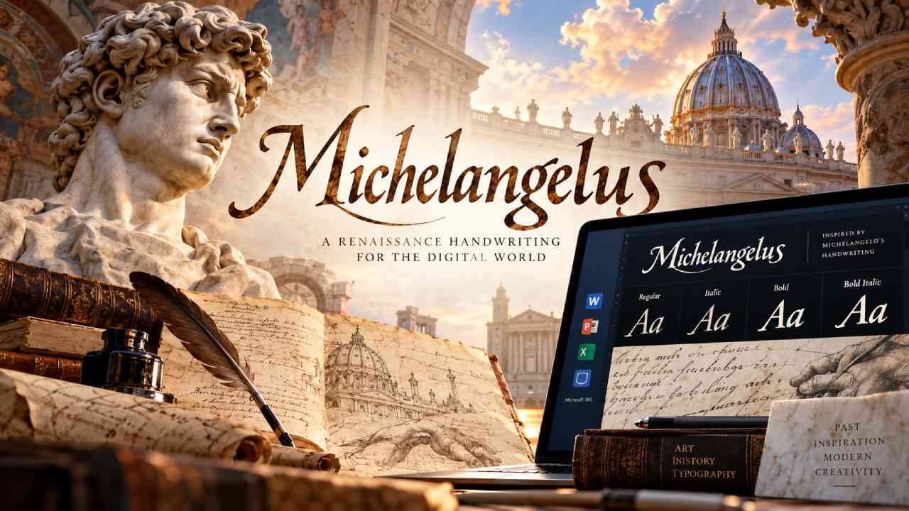
Mayumiotero – Centuries after Michelangelo Buonarroti shaped Renaissance art, his visual legacy has entered the digital world. Michelangelus Brings elements of the Italian artist’s handwriting into a modern typeface designed for contemporary communication. The project connects historical research, graphic design, and digital technology in an unusual way. Instead of simply copying old letters, designers studied the visual character behind Michelangelo’s writing. They then transformed those details into a practical typography system. Microsoft plans to include Michelangelus within Microsoft 365, which could introduce the font to a broad audience. As a result, users may encounter Renaissance-inspired letterforms while creating presentations or documents. The idea feels especially relevant today because digital tools continue to reshape our relationship with cultural heritage. In this case, technology does not replace the original work. Instead, it offers another way to experience visual ideas that first appeared centuries ago.
Read Also: What Is a Firewall? Meet the Digital Guard Protecting Your Devices
A Historic Basilica Inspired the Michelangelus Project
The story begins with Saint Peter’s Basilica in Vatican City. Fabbrica di San Pietro, the institution responsible for maintaining the basilica, wanted to connect cultural heritage with modern communication. Therefore, the organization explored ways to reinterpret Michelangelo’s visual legacy for contemporary audiences. The project also carries symbolic value because it connects with the 400th anniversary of the basilica’s consecration. At first, Michelangelus had a more focused purpose. Designers developed it for communication materials connected with Saint Peter’s Basilica. These applications included both printed and digital formats. However, the concept soon gained a wider direction. Making the font available beyond the basilica could allow more people to interact with the project. This shift transformed Michelangelus from a location-specific design into a digital cultural project. Consequently, an idea rooted in Vatican history can now reach users far beyond Rome.
Studiogusto Turned Historical Research Into Modern Typography
Italian design agency Studiogusto handled the creative and technical development of Michelangelus. However, the team did not begin the project by drawing random Renaissance-style letters. Instead, its designers researched Michelangelo’s original writing and historical inscriptions. They examined manuscripts preserved in Vatican archives and looked closely at recurring visual details. For example, they studied letter proportions, spacing, rhythm, and the relationship between empty and filled areas. These elements helped reveal the structure behind Michelangelo’s handwriting. Moreover, the team considered the energy and personality visible in his writing. This research gave designers a foundation for the new typeface. They could then translate historical observations into a consistent digital system. The process highlights an important aspect of modern typography. Creating a historical typeface requires more than visual imitation. Designers must understand why individual forms work before adapting them for modern screens, documents, and layouts.
Michelangelus Brings Character Without Copying Every Detail
Historical inspiration does not always require exact reproduction. In fact, Michelangelus Brings Michelangelo’s visual character forward without trying to recreate every handwritten stroke. This choice gives the typeface greater freedom to work in modern environments. A perfect digital copy of old handwriting could appear authentic, yet it might become difficult to read across different sizes. Therefore, the designers focused on deeper visual principles. They studied proportions, rhythm, spacing, and recurring shapes. Afterward, they adapted those elements into a more organized typography system. Certain unusual details still remain. They give Michelangelus an identity that feels different from a conventional modern font. At the same time, the letters maintain enough structure for practical use. This balance between expression and function matters. Good typography should create personality without distracting readers from the message. Michelangelus attempts to achieve both goals while keeping a clear connection to its historical inspiration.
Michelangelo’s Pietà Influenced the Capital Letter Design
Michelangelo’s handwriting provided only part of the visual reference. The design team also studied inscriptions linked to his artistic legacy. One important source came from the Pietà, the famous sculpture depicting Mary holding the body of Jesus. Its inscription contains tall and relatively narrow letterforms. Those characteristics helped guide the capital letters within Michelangelus. In addition, Studiogusto examined inscriptions inside Saint Peter’s Basilica. The designers paid particular attention to the letter “M.” It offered a strong starting point because it appears in relevant historical material. Of course, it also carries a symbolic connection with Michelangelo’s name. Meanwhile, the italic lowercase letters follow his handwriting more closely. This combination creates a typeface with several historical layers. Instead of relying on one manuscript, the designers combined different sources. As a result, the final visual system reflects both Michelangelo’s personal writing and the monumental lettering connected with his artistic world.
More Than 500 Characters Expand the Font System
Building a complete digital typeface involves much more than designing the alphabet. Studiogusto created more than 500 characters for each Michelangelus style. The family includes Regular, Italic, Bold, and Bold Italic versions. Therefore, designers and everyday users can create visual contrast while keeping the same overall identity. The development process also required creative decisions when historical examples were unavailable. Numbers presented one interesting challenge. The team lacked a complete set of numerals directly written by Michelangelo. Consequently, designers developed them by studying existing letterforms. For example, the number one takes visual inspiration from the letter “I.” Such decisions demonstrate the complexity behind digital typography. Every symbol must feel connected to the rest of the family. At the same time, each character needs enough clarity to work independently. Michelangelus therefore represents both artistic interpretation and technical design. Historical inspiration may start the process, but careful construction turns that inspiration into a usable font.
Readability Remains Central to the Michelangelus Identity
A beautiful typeface loses much of its value when readers struggle to understand it. Interestingly, historical accounts suggest that Michelangelo himself cared about clear handwriting. He exchanged letters with his nephew Lionardo Buonarroti and sometimes complained about the difficulty of reading Lionardo’s writing. That small personal detail adds another layer to the Michelangelus story. The designers wanted the new font to carry personality while remaining readable. Therefore, they avoided turning it into a purely decorative experiment. Clear proportions and organized spacing help the letters work within modern layouts. Meanwhile, distinctive shapes preserve the artistic character behind the concept. This balance matters because today’s fonts appear across many formats. A typeface may need to work in a large presentation title and a smaller section of text. For that reason, readability remains more than a technical requirement. It becomes part of the font’s connection with Michelangelo’s own interest in clear written communication.
Read Also: Motion Graphic Design: Bringing Visual Ideas to Life Through Animation
Microsoft 365 Opens the Font to Modern Users
The connection with Microsoft gives Michelangelus a much larger digital stage. Microsoft plans to introduce the typeface through its Microsoft 365 font collection. Consequently, users could eventually access it through familiar productivity applications. This distribution strategy changes the scale of the project. A typeface originally linked with Saint Peter’s Basilica can reach students, designers, professionals, and other users worldwide. Meanwhile, people who want earlier access can install the available font files manually on compatible systems. The wider rollout through Microsoft 365 is expected toward the end of 2026. From a visual technology perspective, this development is particularly interesting. Digital platforms can make specialized cultural projects far more accessible than traditional physical distribution. Users no longer need to visit an archive to encounter a modern interpretation of historical lettering. Instead, that design can become part of everyday creative work on a computer.
Online Debate Questions How Closely the Font Resembles Michelangelo
The release has also inspired debate among typography enthusiasts and online users. Some observers believe Michelangelus looks too different from Michelangelo’s surviving handwriting. In particular, discussions have focused on certain capital letters, including “A” and “M.” Critics argue that the modern interpretation moves too far from the historical source. However, this reaction also highlights a misunderstanding about the project’s goal. Studiogusto did not design Michelangelus as a perfect handwriting replica. Instead, the team translated visual principles from Michelangelo’s writing into contemporary typography. That distinction changes how the font should be evaluated. Historical accuracy remains important, but practical readability also matters. Furthermore, modern typefaces require characters and systems that may not exist in historical documents. Designers must fill those gaps carefully. Therefore, the debate raises a larger question: should historical typography imitate the past exactly, or should designers adapt it for modern use?
Michelangelus Brings Cultural Heritage Into Everyday Technology
The strongest idea behind the project may be its ability to connect two very different periods. Michelangelus Brings a Renaissance-inspired visual language into an era shaped by screens, software, and digital communication. Michelangelo worked with stone, paper, ink, architecture, and physical space. Modern designers work with vectors, pixels, digital files, and responsive layouts. Yet both worlds depend on visual proportion and careful composition. Michelangelus creates a bridge between them. The font does not replace original manuscripts or historic inscriptions. Instead, it encourages people to discover their visual qualities through a contemporary medium. Microsoft 365 could make that experience even more accessible. For designers, the project also offers a useful lesson. Innovation does not always require abandoning the past. Sometimes, studying historical details can inspire something that feels surprisingly modern. Michelangelus demonstrates how technology can help cultural heritage enter new creative spaces.