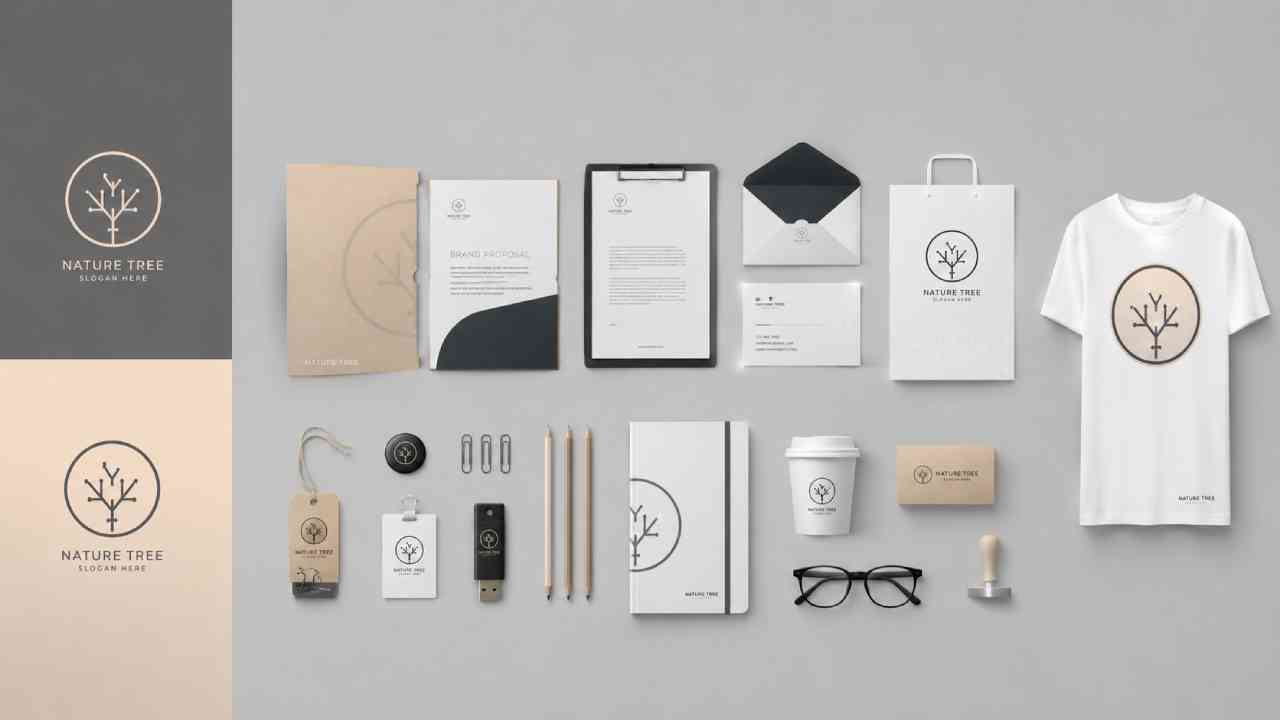
Mayumiotero – Logo and Branding Design once centered heavily on creating one memorable symbol. Today, however, modern brands need a much broader visual system. A logo must work alongside typography, color, imagery, motion, packaging, social media, and digital interfaces. As a result, designers increasingly think about how every element behaves as part of one identity. This shift is especially important because audiences now encounter brands across many screen sizes and platforms. A detailed logo may look impressive on a billboard but become unreadable as a small app icon. Therefore, flexibility has become just as important as originality. Strong visual identities can simplify, expand, or adapt without becoming unrecognizable. In practice, the most effective branding does not depend on one graphic alone. Instead, it creates a recognizable visual language that remains consistent wherever customers meet the brand.
Read Also: Google Launches Gemini 3.7 Flash Just Three Weeks Later With Much Lower Pricing
Minimalism Is Becoming More Distinctive
Minimal branding remains influential, but the approach is changing. Earlier minimalist identities often relied on clean sans-serif typography, neutral colors, and simple geometric marks. While those elements remain useful, excessive simplification can make different brands look surprisingly similar. Consequently, designers are adding more personality to restrained visual systems. A distinctive letterform, unusual spacing, custom icon, or memorable accent can transform an otherwise simple identity. The goal is no longer to remove every decorative element. Instead, successful minimalism removes distractions while preserving character. This difference matters because recognition is one of branding’s most important functions. If customers cannot distinguish one company from another, visual cleanliness offers limited value. Modern minimal branding works best when simplicity supports memorability rather than replacing it. Therefore, designers are learning to treat minimalism as a method of visual focus instead of a universal aesthetic formula.
Expressive Typography Gives Brands a Stronger Voice
Typography is becoming one of the most powerful elements in contemporary branding. Rather than choosing a neutral typeface and building everything around a separate symbol, designers increasingly allow lettering itself to carry personality. Custom wordmarks, variable fonts, unusual proportions, and expressive serif styles can give a brand an immediate voice. This approach works especially well in digital environments because typography can scale across websites, social posts, advertisements, and mobile interfaces. Moreover, distinctive lettering can create recognition even when the primary logo is absent. Yet expressive typography still requires discipline. A dramatic typeface may attract attention, but poor readability can weaken communication. For that reason, successful systems often combine expressive display typography with simpler supporting fonts. The contrast keeps important messages clear while preserving visual character. Ultimately, typography is no longer just supporting branding. In many modern identities, it has become the branding itself.
Dynamic Identity Makes Branding More Flexible
A dynamic identity does not force a brand to appear exactly the same in every situation. Instead, selected elements can change while a recognizable visual foundation remains intact. Colors may shift between campaigns, patterns can react to content, and logo compositions may adapt to different formats. This flexibility makes dynamic branding particularly suitable for media companies, cultural organizations, entertainment brands, and digital platforms. However, variation needs clear rules. Without a consistent structure, flexibility can quickly become visual confusion. Designers usually maintain recognizable elements such as typography, proportions, motion behavior, or a core symbol. Those anchors allow the identity to evolve without losing recognition. In my view, this approach reflects how people experience brands today. Digital environments are constantly changing, so a completely static identity can sometimes feel restrictive. Dynamic systems offer movement and variety while still protecting the brand’s essential character.
Responsive Logos Are Designed for Every Screen
Modern branding must survive dramatic changes in scale. A full logo may appear across a storefront, while the same identity needs to fit inside a tiny browser tab. Responsive logo systems solve this problem by creating several levels of visual complexity. A large version might include a symbol, complete brand name, and tagline. At medium sizes, the tagline can disappear. On smaller screens, only the symbol or monogram may remain. Importantly, these variations are not separate logos with unrelated designs. They are parts of the same system. Consistent proportions, shapes, and visual cues keep each version connected. As mobile experiences continue to shape daily digital behavior, this adaptability has become essential rather than optional. Consequently, designers need to test identities at realistic sizes early in the creative process. A beautiful desktop logo offers little value if it becomes impossible to recognize on a smartphone.
Retro Influences Are Returning With Modern Details
Nostalgia continues to influence Logo and Branding Design, although modern retro branding rarely copies the past exactly. Designers borrow bold lettering, hand-drawn illustrations, grain textures, nostalgic color combinations, and packaging references from earlier decades. Then, they combine those elements with cleaner layouts and contemporary digital applications. This balance allows a brand to feel familiar without appearing outdated. Retro influences are particularly effective for food, fashion, hospitality, entertainment, and lifestyle brands because they can create an emotional connection quickly. Still, choosing a historical style simply because it looks fashionable can weaken authenticity. The visual era should support the story and personality of the brand. Otherwise, nostalgia becomes decoration without meaning. When used thoughtfully, retro references provide warmth and character while modern composition keeps the identity relevant. That combination explains why old visual languages continue to find new audiences.
Read Also: Why Tablescaping Is Becoming a New Creative Lifestyle Trend
Motion Is Becoming Part of Brand Identity
A modern visual identity no longer exists only in static form. Logos appear during app launches, video introductions, social media posts, digital advertisements, and interactive website experiences. Therefore, motion design is becoming an important part of branding systems. A symbol might expand, rotate, transform, or respond to user interaction. Typography can also move according to predefined rules. These behaviors give brands another way to express personality. A technology company might use precise, controlled animation, while an entertainment brand could choose energetic movement. However, motion should never exist simply to demonstrate technical ability. Excessive animation can distract users and slow down communication. Effective motion branding remains purposeful, recognizable, and relatively simple. More importantly, its behavior should feel connected to the static identity. When both systems work together, audiences experience the same brand personality whether an element is moving or standing still.
Imperfect and Human-Looking Design Adds Personality
Highly polished digital graphics have dominated branding for years. Yet many designers are now exploring visual elements that feel less mechanical. Hand-drawn lettering, irregular illustrations, textured surfaces, imperfect shapes, and collage-inspired compositions can introduce a stronger human presence. This approach does not mean professional design is becoming careless. Instead, controlled imperfection can make an identity feel warmer and more distinctive. The effect is especially useful for independent food brands, creative businesses, cafés, fashion labels, and lifestyle companies. As automated design tools become more accessible, intentionally crafted details may also help visual identities avoid looking generic. Nevertheless, authenticity matters. Artificially adding rough textures to every project does not automatically create personality. The visual treatment should reflect the brand’s actual character. When used with purpose, handcrafted elements can provide emotional contrast to the increasingly polished digital environments surrounding consumers.
Strong Branding Depends on Systems, Not Passing Trends
Design trends can provide useful inspiration, but a successful identity needs to survive beyond one season. Logo and Branding Design works best when every creative decision supports a clear brand idea. Minimalism, expressive typography, dynamic logos, retro references, or motion can all be effective. However, none of them can replace strategic thinking. Designers first need to understand the audience, positioning, personality, and practical environments in which an identity will appear. From there, trends can become tools rather than rules. This distinction is increasingly important because visual styles spread rapidly across digital platforms. A fashionable aesthetic can become familiar within months. A strong brand system, by comparison, can evolve while keeping its recognizable foundation. Therefore, the future of visual identity is not about finding one dominant design style. It is about building flexible systems that remain clear, memorable, useful, and unmistakably connected to the brands they represent.