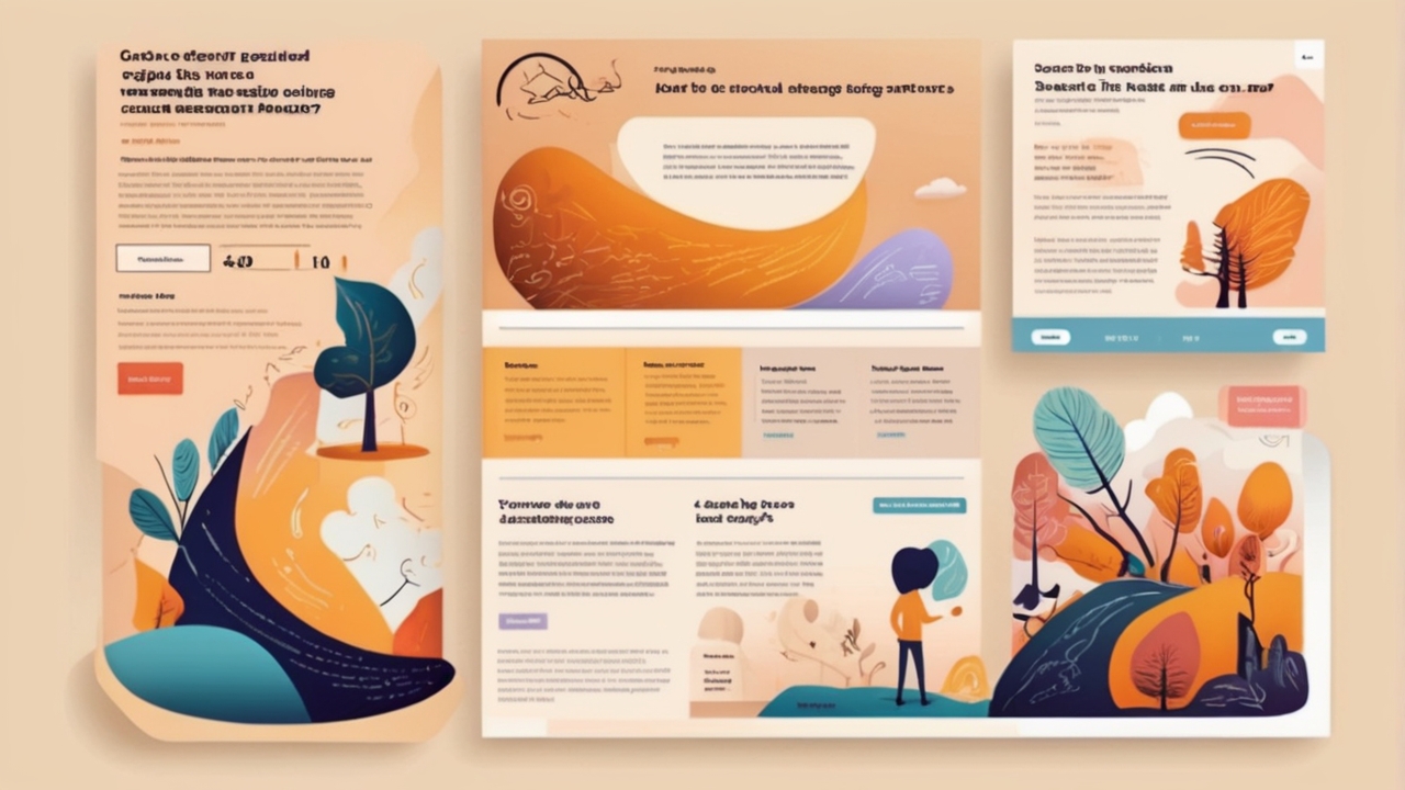
Mayumiotero – Visual Persuasion has become a decisive factor in landing page performance, especially in an era where attention spans are shrinking rapidly. Within the first few seconds, visitors subconsciously decide whether a page feels trustworthy, relevant, or worth exploring further. Therefore, design is no longer just decoration; it is a silent salesperson. Colors, layouts, typography, and imagery work together to guide emotions before logic even kicks in. From an expert perspective, this psychological layer often determines conversion success more than copy alone. When done correctly, visual persuasion gently nudges users toward action without feeling forced or manipulative.
“Read also: How Roblox Is Quietly Turning AI Into a Creator Production Engine“
The Psychology Behind Visual Persuasion and Human Decision-Making
At its core, Visual Persuasion leverages how the human brain processes visual information faster than text. Research consistently shows that people form first impressions in under a second, primarily based on visual cues. Consequently, landing pages that align with cognitive expectations feel intuitive and safe. Visual hierarchy, for example, helps users scan content effortlessly, reducing mental friction. From experience, designers who understand perception psychology create pages that feel “right” even before users can explain why. This subconscious comfort significantly increases engagement and trust.
Color, Emotion, and the Power of First Impressions
Color plays a crucial role in Visual Persuasion because it directly influences emotional responses. For instance, blue often communicates trust and stability, while red can create urgency or excitement. However, effective persuasion is not about picking trendy colors but about aligning them with brand intent and audience psychology. Moreover, contrast guides attention toward call-to-action buttons without shouting. In practice, landing pages that balance emotional color use with visual clarity tend to convert better. Therefore, color becomes a strategic tool, not an aesthetic afterthought.
Visual Hierarchy as a Silent Guide for User Behavior
Visual Persuasion thrives when users instinctively know where to look next. This is where visual hierarchy becomes essential. Headline size, spacing, imagery placement, and directional cues subtly guide the eye through the page. Instead of overwhelming users with information, a strong hierarchy creates a natural flow. In real-world testing, landing pages with clear visual paths consistently outperform cluttered designs. As a result, users feel in control, even though the design quietly leads them toward conversion goals.
Imagery and Storytelling That Build Instant Trust
Images are powerful storytelling tools in Visual Persuasion. Authentic photos, product visuals, or contextual illustrations help users imagine themselves benefiting from an offer. Conversely, generic stock images often weaken credibility. From a trust-building standpoint, visuals that reflect real people, real use cases, or real environments create emotional resonance. Over time, this storytelling approach strengthens brand authority. Therefore, imagery should not merely fill space but actively support the narrative of the landing page.
“Read also: AI Literacy Redefines Work: How Education and Flexibility Shape the Future Workforce“
Typography and Readability as Persuasive Design Elements
Typography is often underestimated in Visual Persuasion, yet it strongly affects perception and comprehension. Clean, readable fonts signal professionalism, while poor typography creates cognitive strain. Additionally, font weight and spacing influence how important information is perceived. In practice, well-structured typography reduces bounce rates by making content easier to consume. Thus, typography quietly reinforces credibility and keeps users engaged longer, supporting both usability and persuasion.
Reducing Friction Through Visual Simplicity
One of the most effective persuasion techniques is reducing friction. Visually, this means removing unnecessary elements that distract or confuse users. White space, for example, improves focus and comprehension. From an analytical perspective, minimalistic landing pages often outperform complex ones because they respect users’ mental bandwidth. Instead of competing for attention, each element serves a clear purpose. As a result, Visual Persuasion becomes smoother and more respectful of user intent.
Visual Persuasion and Conversion-Centered Design Strategy
Ultimately, Visual Persuasion should align with measurable conversion goals. Every design decision from layout to iconography must support a clear objective. Successful landing pages combine visual appeal with data-driven testing. By analyzing heatmaps, scroll depth, and user behavior, designers refine persuasive elements over time. This balance between creativity and analytics builds authority and long-term trust. Therefore, visual persuasion is not a one-time effort but an evolving strategy.
Why Visual Persuasion Defines Modern Landing Page Success
In conclusion, Visual Persuasion is no longer optional in landing page design. It shapes perception, builds trust, and influences decisions before users read a single word. Brands that invest in thoughtful visual strategy consistently outperform those that rely on copy alone. From experience and observation, the most effective landing pages feel effortless, intuitive, and emotionally aligned with users. That is the true power of visual persuasion guiding action without pressure, and influence without resistance.