Mayumiotero – Imperfect Design is the New Trend because the world of digital visuals is moving away from designs that feel too neat, too clean, and too predictable. In recent years, many brands have used similar minimalist styles. As a result, visuals on social media, websites, banners, and posters often look almost the same. However, an interesting shift is now taking place. Designs that look slightly messy are starting to be seen as more distinctive, more human, and even more expensive. This style is not about randomly stacking visual elements. Instead, imperfect design uses imperfection as a visual strategy. It includes rough textures, asymmetrical letters, collage-style images, hand-drawn lines, and bold colors. Although it looks free and spontaneous, every element still works together to create an aesthetic impression. Therefore, this trend is suitable for modern brands that want to look different without losing their professional value.
Read Also: Google Translate at 20: From Simple Tool to a Bridge Connecting Billions
Imperfect Design is the New Trend Because Audiences Are Getting Tired of Overly Perfect Visuals
Imperfect design is becoming attractive because digital audiences have seen too many visuals that are neat, smooth, and safe. Every day, people open social media and find designs with almost the same pattern. There is a clean photo, bold text, neutral colors, and a very organized layout. At first, this kind of style did look professional. However, over time, visuals that are too perfect can feel cold and lifeless. Therefore, imperfect design arrives like fresh air. This style gives a spontaneous, honest, and more human impression. For example, a poster with torn paper effects, tilted text, or grainy texture can feel more alive than a plain and symmetrical design. In addition, visuals that are not too perfect often make people stop for a moment because they look different. In a fast-moving content world, that kind of attention is very valuable. Therefore, imperfect design is not only an aesthetic style, but also a strategy to make visuals more memorable.
A Messy Style That Looks Expensive Does Not Mean Careless Design
Many people misunderstand imperfect design and think it means a design can be made carelessly. In reality, this style still requires composition, visual sense, and a strong understanding of aesthetics. A design that looks expensive usually has a balance between free elements and clear structure. For example, typography can be slightly misaligned, but the text hierarchy must still be readable. Colors can be contrasting, but they still need to have a visual connection. Images can look like a collage, yet the main focus must not disappear. This is what makes imperfect design unique. It looks spontaneous on the surface, but it is actually built with creative control. In addition, this style often uses small details that create a premium impression, such as paper textures, vintage effects, soft shadows, or editorial layouts. In this way, the design does not look cheap. Instead, it feels like a creative work with strong character. Therefore, imperfect design is suitable for brands that want to appear bold, artistic, and different from common templates.
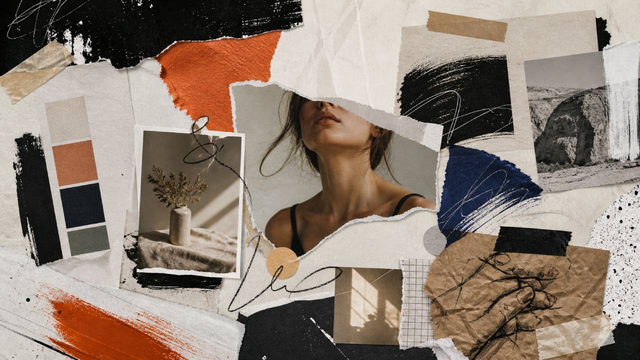
Textures, Collages, and Doodles Make Visuals Feel More Alive
One of the main strengths of imperfect design lies in the use of textures and visual elements that are not too clean. Grain texture, folded paper marks, pencil scratches, paint effects, or photo cutouts can create a more realistic atmosphere. In addition, collage also plays an important role in this style. Image pieces arranged like magazine cutouts give a creative and expressive impression. Even simple doodles such as hand-drawn circles, arrows, or underlines can make a design feel more communicative. However, these elements must be used carefully. If there are too many of them, the visual can look crowded and tiring. Therefore, designers usually choose only a few elements to build a strong character. For example, one main photo, one background texture, and a few doodle accents are enough to create a strong imperfect look. With this approach, the design feels more human. As a result, the audience does not only see the visual, but also feels the creative energy behind it.
Experimental Typography Becomes the Main Weapon in Imperfect Design
Typography plays a major role in imperfect design. In this style, letters do not always have to be neat, aligned, or too formal. In fact, large, tilted, layered, or uniquely shaped fonts often become the main attraction. However, readability remains important. A good design should not make it difficult for the audience to understand the message. Therefore, typography experiments must still have direction. For example, the main headline can use a bold font with slight distortion, while the supporting text uses a simpler font for easier reading. In addition, the combination of serif and sans-serif fonts is also often used to create an expensive editorial impression. The transition between classic and modern styles makes the visual feel more dynamic. On the other hand, handwritten typography can add a more personal touch. When used properly, this element can make the design look more authentic. Therefore, typography in imperfect design is not just decoration. It becomes a visual language that builds mood, character, and brand identity.
Bold Colors Make the Design Look More Characterful
Imperfect design often uses bolder colors than regular minimalist design. Colors such as brick red, electric blue, faded yellow, olive green, deep black, or vintage cream often appear in this style. However, these colors are not always used in a loud way. Sometimes, strong colors are only used as accents so the design still looks elegant. In addition, color combinations that are not too perfect can actually create a unique impression. For example, a faded background with bright text can create a strong editorial mood. Meanwhile, pastel colors combined with rough textures can produce a soft yet bold appearance. In the context of branding, this kind of color choice helps content stand out among similar visuals. However, designers still need to pay attention to contrast. Text must remain easy to read, especially if the design is used for article banners or social media. With the right control, bold colors in imperfect design can create an impression that feels expensive, fresh, and not generic.
Read Also: Micro Adventure A Short Vacation That Will Make Life More Lively Without Expending a Lot
Imperfect Design is Suitable for Brands That Want to Look Authentic
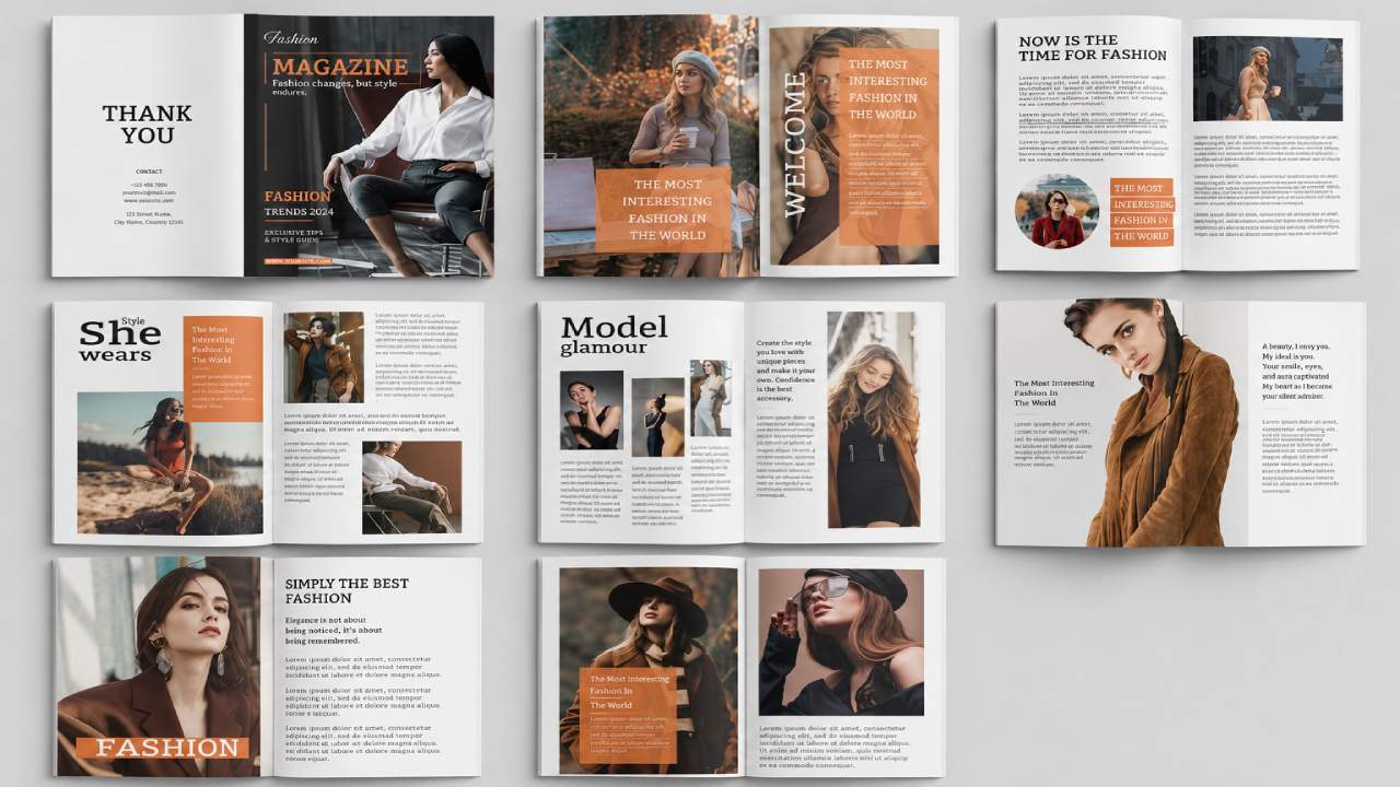
In the digital era, audiences are becoming more sensitive to visuals that feel too artificial. They are not only looking for beautiful appearances, but also for character. Therefore, imperfect design is suitable for brands that want to look more authentic. This style creates space for stories, emotions, and personality. A fashion brand can use editorial collages to show an artistic impression. A culinary brand can use paper textures and warm colors to feel more approachable. Meanwhile, light news media can use dynamic layouts to make content look fresher. In addition, imperfect design is also suitable for creators who want to build a strong visual identity. When many pieces of content look the same, a different style becomes easier to recognize. However, being authentic does not mean losing professionalism. Brands still need to maintain image quality, composition, and color consistency. This way, the design still looks mature. In the end, imperfect design helps brands appear more human without looking cheap.
Why Imperfect Design Works for Digital Content and PBN Banners
For digital content, imperfect design has a major advantage. This style can create visuals that quickly attract attention. In the world of PBN content, article banners often become the first door that makes readers interested. If the banner looks too ordinary, the article may not stand out. On the other hand, a banner with an imperfect style can create a unique impression from the beginning. For example, an article about design trends can use a collage layout, large text, contrasting colors, and vintage textures. A fashion article can use a torn magazine effect. A technology article can combine light glitch effects with experimental typography. In addition, this design style also helps content feel fresher. However, it is important not to make the banner too crowded. The logo, headline, and main visual still need enough breathing space. That way, the article message remains easy to understand. Therefore, imperfect design is highly suitable for PBN content that wants to look creative, modern, and different from common visual templates.
The Future of Digital Visuals Will Be Bolder and More Human
Imperfect design shows that the future of digital visuals will not always move toward cleaner and more perfect appearances. In fact, many audiences are starting to prefer visuals that feel bolder, more personal, and more human. This makes sense because design technology is becoming easier to use. Many people can now create neat visuals with templates or AI assistance. As a result, the main difference is no longer just neatness, but character. This is where imperfect design has a strong position. This style gives space for experimentation, emotion, and visual storytelling. In addition, designs that are not too perfect often feel closer to reality. They remind us that creativity does not always have to be sterile. Sometimes, a little chaos can actually make a work feel alive. Therefore, this trend will likely continue to grow, especially in editorial, fashion, lifestyle, music, technology, and social media content. With the right approach, imperfect design can become a visual style that is not only attractive, but also highly valuable.