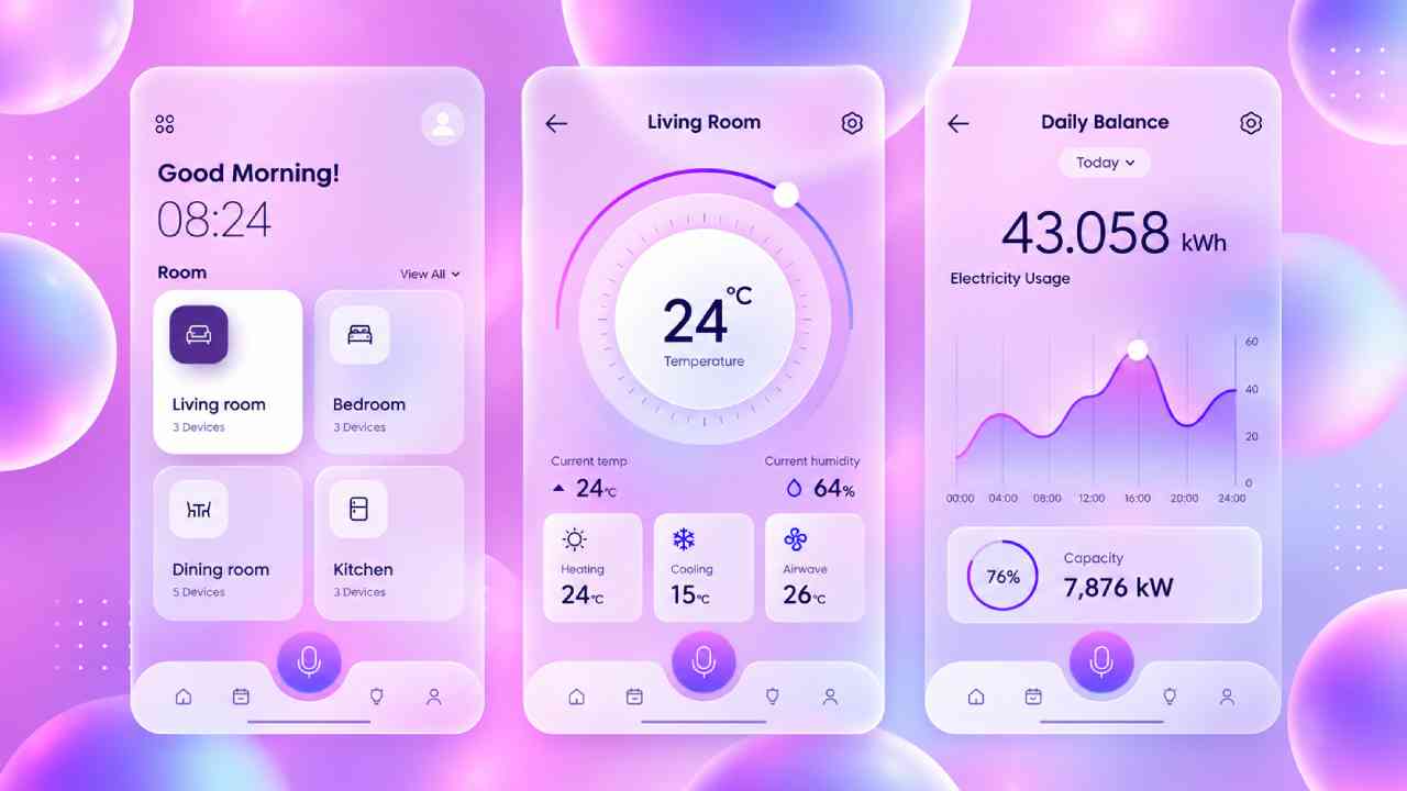
Mayumiotero – Glassmorphism Design has changed how digital interfaces can express depth and elegance. Instead of relying on flat blocks, this style uses translucent surfaces that resemble frosted glass. Background colors remain visible, yet a soft blur keeps the foreground clear. As a result, cards, menus, and panels appear to float above the page. The approach feels modern without requiring excessive decoration. Moreover, designers can combine transparency with subtle borders and shadows to create stronger visual layers. This balance is one reason the style works well across websites, mobile apps, and dashboards. However, the effect needs careful control. Too much transparency can weaken readability, while excessive blur may distract users. When used with purpose, the technique creates a clean visual hierarchy. It can make a simple interface feel polished, spacious, and more immersive.
Read Also: Free Gemini Users Will Soon Lose Access to Advanced AI Models
Frosted Glass Effects Create a Strong Sense of Depth
The signature feature of Glassmorphism Design is its frosted glass effect. Designers usually place a translucent panel over a colorful or detailed background. They then blur the content behind that panel. Consequently, users can sense what exists underneath without losing focus on the main information. A thin border can further define the surface. Meanwhile, a gentle shadow separates the panel from surrounding elements. Together, these details create the illusion of physical depth on a flat screen. The technique becomes especially effective when several layers overlap. Each layer can use a different level of transparency to establish visual priority. Still, restraint remains important. A strong interface should guide attention rather than compete for it. Therefore, experienced designers often reserve the glass effect for important cards, navigation elements, or selected information. This focused approach keeps the interface attractive while preserving its practical purpose.
Transparency Works Best When Contrast Remains Clear
Transparency may look beautiful, but readability should remain the priority. A common mistake is making a glass panel so transparent that text starts blending into the background. Therefore, designers should test contrast across different images, gradients, and screen sizes. Dark text may work on a pale panel, while white text often needs a darker translucent surface. In addition, a subtle overlay can stabilize contrast when the background contains several colors. Typography also matters. Clean fonts with clear letterforms usually perform better than decorative typefaces in transparent interfaces. Designers should also avoid placing important text over highly detailed areas. Instead, they can increase the blur or opacity behind essential information. These small decisions improve both accessibility and usability. Ultimately, Glassmorphism Design should never force users to work harder to read a button, heading, or message. Visual beauty becomes more valuable when it supports effortless interaction.
Color and Light Give Glassmorphism Its Character
Color plays a major role in the personality of Glassmorphism Design. Blue, violet, cyan, and pink gradients are common because they create noticeable reflections behind transparent surfaces. However, bright futuristic colors are not the only option. Warm beige, soft green, muted orange, or neutral gray can produce a calmer aesthetic. Therefore, the same technique can fit many visual identities. Lighting also changes how the glass effect feels. A soft highlight along one edge can suggest reflected light. Likewise, a restrained shadow can make the panel appear slightly elevated. The goal is not to reproduce real glass perfectly. Instead, designers use familiar visual signals to suggest its texture and depth. This gives the interface a tactile quality without adding physical materials. Furthermore, careful color choices can direct attention toward buttons and important information. When color, light, and transparency work together, the interface feels intentional rather than decorative.
Glassmorphism Can Improve Visual Hierarchy
A successful interface needs more than attractive effects. Users should quickly understand what deserves their attention. Glassmorphism Design can support this goal through layering. For example, a primary card can use stronger opacity and a clearer border. Secondary cards can appear lighter and less prominent. Meanwhile, the background remains visually separated through blur. This creates an understandable relationship between different interface elements. In addition, designers can use spacing to strengthen the hierarchy. Generous space around a glass card often makes it appear more important. Typography can then reinforce that structure through clear differences between headings and body text. However, every element does not need the same glass treatment. In fact, mixing solid surfaces with transparent ones can create stronger contrast. This approach also prevents the design from becoming visually repetitive. When designers treat glass as a hierarchy tool rather than a simple effect, the interface becomes easier to scan and understand.
Read Also: Creative Knitting Projects to Make Your Everyday Life Cozier
Modern Interfaces Give the Style Room to Evolve
Glassmorphism Design fits naturally into many modern digital products. Dashboard interfaces can use transparent cards to separate statistics without creating heavy visual walls. Mobile apps can apply the effect to navigation menus, media controls, or notification panels. Meanwhile, landing pages can place glass panels over large illustrations or atmospheric gradients. The technique also works well for technology, finance, creative portfolios, and premium digital services. Nevertheless, designers should adapt the style to the product rather than copying a single visual formula. A financial dashboard may require stronger contrast and fewer decorative layers. In comparison, a creative portfolio can experiment with more transparency and color. Responsive design also deserves attention. Effects that look elegant on a large monitor may become crowded on a small phone. Therefore, opacity, blur, spacing, and typography should respond to screen size. Flexibility helps the visual language remain useful across different contexts.
Performance and Accessibility Matter as Much as Appearance
Beautiful interfaces can still fail when they ignore performance or accessibility. Blur effects may require more rendering work than simple solid backgrounds, especially when many translucent layers appear at once. For that reason, designers and developers should avoid unnecessary effects. A few carefully selected glass panels can often achieve more than dozens of blurred components. Accessibility deserves equal attention. Text must maintain sufficient contrast against changing backgrounds. Interactive elements should also remain easy to identify. Furthermore, the design should not depend only on transparency to communicate hierarchy or status. Borders, spacing, labels, and typography can provide additional visual cues. Testing is essential because the interface may behave differently across browsers, displays, and devices. Therefore, a strong implementation combines aesthetic ambition with technical discipline. Glassmorphism Design becomes more effective when visual effects support the user experience instead of slowing it down or making information harder to understand.
Thoughtful Restraint Makes Glassmorphism Feel Premium
The most impressive Glassmorphism Design often uses fewer effects, not more. When every button, menu, and container looks like glass, the visual language loses its impact. Instead, designers can select specific areas where transparency adds meaning. A floating navigation bar may benefit from the effect because users can still sense the content behind it. Likewise, a featured card can stand above a colorful background without completely hiding it. These choices make the glass treatment feel intentional. Moreover, restrained styling tends to age better than extreme visual trends. Clean typography, consistent spacing, accessible contrast, and simple navigation remain valuable even when design fashions change. Glass effects should complement those fundamentals rather than replace them. In practice, this balance separates polished interfaces from designs that simply imitate a trend. When transparency, blur, light, and hierarchy serve a clear purpose, glassmorphism becomes a flexible visual language for modern digital experiences.